 This peice I tried to focus more on the movement of the ground and the color choice, becuase that's what the college representatives told me to do on portfolio day... so I did, or tried at least
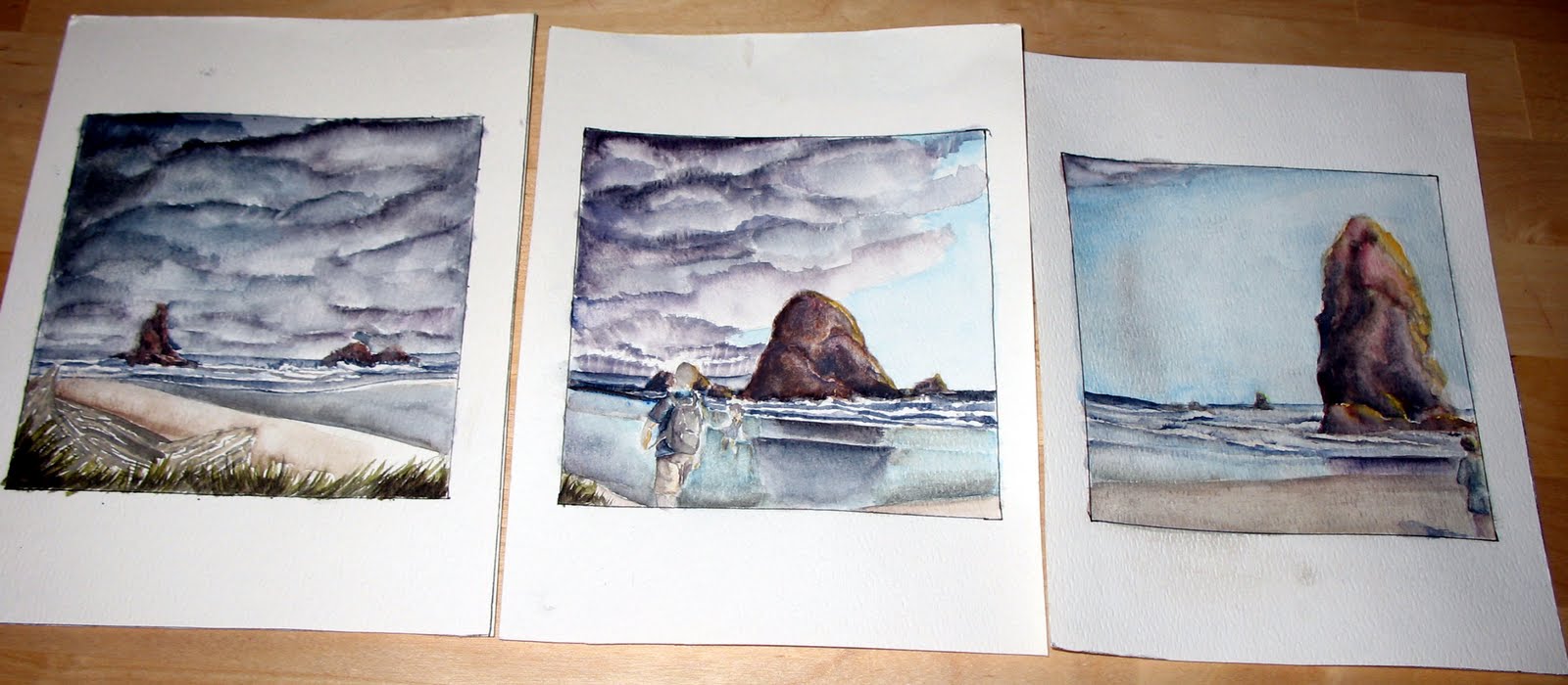 For this one I wanted to make a series of the beach at the same time but segmet it to show the progression of the clouds. This one took the longest only becaue it's water color and it is small.
Well as you probably know, I love cute little paintings! so cute! I really like the idea. A series of three is different than your others. It is a nice change. The contrast is very bold. very nice. I would like to see them closer up to see the detail. So, do they go in that order? cause this way, from left to right, it looks like the clouds are going away? i would have thought they would be coming in..
ReplyDeleteThe top piece is a little confusing. What is in the foreground? Grass and a tree? Is the white tree finished?
The ground in the top piece, the bottom quarter, I really feel the movement. I love the value of the reeds and how everything seems to shimmer. To me it feels quite menacing. But at the same time, I agree with Monet in that it is a little confusing--especially the section just behind the tree. Maybe push the value in the clouds a little more? I like that spot of blue just under the tree a lot.
ReplyDeleteI love what you did with your second concentration piece--the three. The rock on the right has nice value and the clouds bring to mind the phrase "tendrils of evil." I am sorry for being somewhat melodramatic. The one thing is, I feel like I am looking through some sort of microscope because of how the beach meets in a 'v' in the center piece, when the rock on the right is closer than the one in the middle. I hope that last bit made some kind of sense.
YAY! They're up!
ReplyDeleteAre these both in watercolor? I saw you working on the three on the bottom in class. I really enjoy them. The colors in the rocks on the three bottom ones is outstanding. Love it :) I think the three paintings work really well together.
The top one is good too see some of that white outlining in some places. If there is anyway you could go back in a fix that, I think it would help your piece. Along with adding a bit more contrast. Anyway, awesome work! See you in class!